10 Things Every Product Manager Can Learn From Headspace
Headspace is one of my favourite apps right now, not just because I derive great value from it but also because it really taught me how to catch my breath, every once in a while. Given this hustle culture in the startup world, you’re constantly running to solve the next problem! This is not reserved to our team alone. This is from teams across our industry and team members are not taking sufficient time to pause and reflect. The combination of this round-the-clock-work and wanting to constantly ship great products has made meditation, exercise, and vacations the need of the hour. It is no wonder that mindfulness has become a $250 Million market. Given how great Headspace is doing in this market, I decided to understand the app better.
For those who haven’t discovered Headspace yet, it’s a mindfulness and meditation app. It promises to make* “Meditation Simple”.* Although it is a worthy mission to pursue, it is a fairly tough task to achieve. However, Headspace has made a strong dent here. In our own team, every other person has experienced at least one session on Headspace and felt much better after it. We love the mindfulness it helps us achieve. But there is more than meditation it has taught me as a PM! Here are few of those invaluable lessons summarised:
1. The right to way to onboard
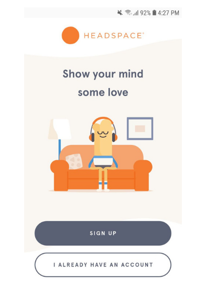
For anyone that downloads the apps, Headspace tells you right away where it sees you using the app. In a bus while traveling, at office amidst a busy day, at home on your comfy couch or even while vacationing in the mountains. No matter who you are or where you are, you can meditate.
In their previous onboarding screens, they simply told you “why” you should meditate. I think they soon realized, this wasn’t even the problem. Everyone knew why it was good, they failed to know when they could meditate. Onboarding your users, means different things to different products. Identifying early on what value to give your user on first launch of your app is very important and it’s a funnel point you should often re-vist and engage with as you grow, Headspace seems to have got this on point!
2. Talk to your users, don’t tell them:
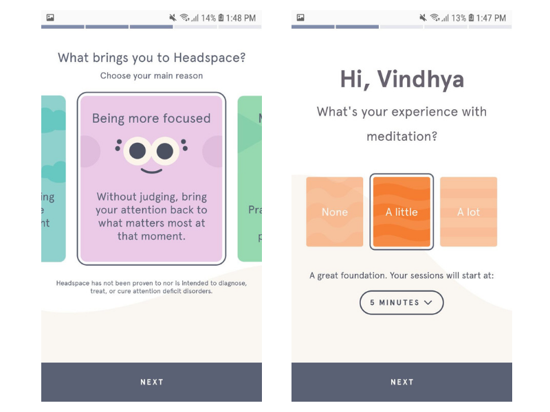
The language feels safe, fresh and easy. It’s almost like you’re talking to that friend who gives you the advice you need, in a way that it doesn’t offend you. An important lesson here is to know how your users talk and therefore how you should interact with them. You usually recommended meditation apps when you’re under a lot of stress or when you’re feeling down. Headspace seems to understand that user emotion very well and their app copy is on point. A lot of apps have very generic content that even targeted users don’t connect with, because it addresses no one in specific. It is vital to understand where your users are, who they are and talk to them.
3. Engage first, sell later :
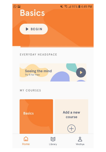
When you first open the app, it doesn’t talk to you about the subscription model of Headspace right away. That information is a scroll away. The first time I was on the app, I had no idea that there was even a paid version of it. On the UX front, it focuses on getting you to complete the first ‘Basic’ meditation session. That’s all and nothing more. So, show the user what you have to offer first up — become their habit and then sell. Ask for their time and their money only after you have proven worthy to them.
4. Design to make it fun:
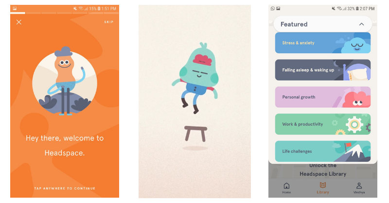
Often, meditation is thought of as a very difficult task to achieve. The general mindset of people is that it is for yogis and monks and not for regular folks. So if you look for “meditation” on the Playstore, you end up with apps where Guruji’s tell you the right way to practice these techniques. For a first timer, this can be quite intimidating. Headspace understands this and therefore creates a fun, engaging, non-generic illustration with toned down colors that create a warm feeling as you enter the Headspace world. The lesson here is — Differentiate on design but also make it relatable to your audience. Every time I see a big-eyed teal amoebic creature on a light purple background, I think of Headspace. The same way, every time a Loco user sees a Hippo they associate it with us. Build a brand that gets recognized outside the app — it’s something that we should continuously strive for.
5. Reward right:
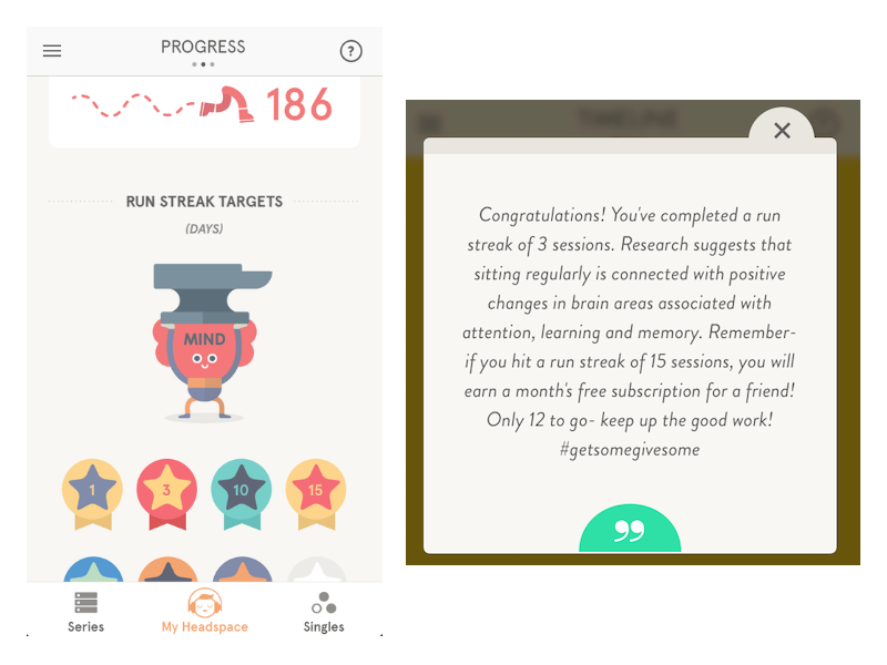
Although this seems quite hard to achieve, probably because meditation is not my habit yet, I think rewarding right is key for any app. I love how the number of streaks start after completing just one day. It gives me a sense of accomplishment the very first time I interact with Headspace. Gamification is used in all kinds of apps, but getting it right is extremely hard. Though I’d love to see some changes in the thought process of Run Streaks (like probably limiting it to day 90 and giving other achievements for check-ins after that), I think it’s a good start! On Loco, we have a concept of streaks, which has seen great numbers for us — but more on that in another blog! My point, keeping the user engaged via little achievements is no easy task, but make sure you reward them more actionable things.
6. Clever push notifications:
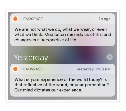
Another thing I truly adore are their notifications. As a company that has 6 games everyday, our challenge is to bring people to the app at the right time. Push Notification CTR’s are hard to crack as it is, but Headspace does something different which I am excited to try for Loco! It gives you these *mindful moments *as they call it. It requires no click through, no action. It simply wants you to rethink, focus and practice being mindful. So if I want to be mindful everyday what could I possibly do? MEDITATE! There is the recall they want! It’s brilliant. I also love that Headspace has the large orange circle as their logo so even when you’re on another app/screen, the logo on the notification tray will grab your attention.
7. Content is key:
While marketing and PR is great, there is nothing like building in-house content to sell your brand value. Headspace seems to have got this bang on! Headspace has a daily blog, a youtube channel with more than 10M views on most of their videos, a podcast and content by the founder himself (monk turned tech mogul) — Andy Puddicombe. Both inside the app and things related to the app, they actively promote what they promise — Making Meditation Simple. Even at Loco, we have learnt how important it is to produce quality content and not just game updates! Which is why we make memes, ask riddles, make short story games on Instagram etc — to engage users while creatingt content that is relatable and still Loco-centric.
8. Create scarcity:
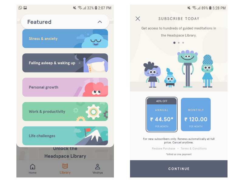
Once I have gone through Headspace enough, I crave for more but now it comes with a paywall. By this time, Headspace has made me understand the value it can give me. To try more, I have to get my wallet out. I am okay with this because I really want to experience what Headspace can offer more. We have understood this very early on at Loco, which is why we don’t have games all the time. We have appointed games where the user has to come in at the right time to play. This scarcity creates a hook for users to keep coming back.
9. Make it social

A great way to get users to come back to the app — get them to add their friends to your app! Headspace lets you nudge your friends and keep them informed about your progress. Whenever you use an app you love, you’re sure to call your friends on it. Once your friends are on the app, you’re hesitant to leave it because there is so much attachment to the community you have built. We started this at Loco too, by introducing the Friends leaderboard, so you can keep your community close-knit and competitive. Headspace also tells you how many people are currently meditating, making you feel like there are like-minded folks around you. We do this in our app too by showing users how many live users are currently playing with you. Knowing that you’re not alone, is a great way to make you feel like you’re part of something bigger than yourself.
10. More research, fewer assumptions.
Headspace is not selling you nonsense. It is not assuming a market that’s solving a problem which exists nowhere. It does not build features over tweet suggestions. It builds via research. They have an entire section dedicated to this on their website, to show you what their ongoing research has found and how they are striving to get better. They rely on data to make strong decisions. While this is a difficult task to achieve, Headspace seems to be doing a great job.
So those were my learnings as a PM from Headspace — an app I enjoy both personally and now professionally!
We’ll keep breaking down apps we love and learn a lesson or two from them. In the meantime, if there’s an app that inspires you or an app you would like us to break down and analyse, let us know in the comments and we’ll give it our best shot!
Resources : Clevertap , UX Design , Business Insider, Forbes